
Sip & Solve: A Coffeehouse App for Creative Problem Solvers


Overview
Project Type: UX Design (Mobile App)
Role: UX Designer, Researcher, Illustrator
Tools Used: Figma, Google Forms, Google Sheets, Pen & Paper
Timeline: 8 weeks
This case study outlines the process of designing a mobile application for a vampire-themed coffeehouse that offers both functionality and a touch of magic. The app enables users to order drinks, customize ingredients, and collaborate with others while drawing inspiration from a story-driven experience.
01
Problem
Modern coffee apps tend to focus solely on utility and transactions. However, many users, particularly students and professionals, also crave personalization, storytelling, and a reason to return. How might we create a coffee-ordering experience that blends functionality with emotional engagement?
02
Target Audience
We identified two key personas:
Priyanka (32, Student)
-
Goal: Enjoy coffee while studying or job searching
-
Frustrations: Can’t understand ingredients, struggles finding the right drink for her mood
Anmol (25, Working Professional)
-
Goal: Quick, bulk orders for office coffee breaks
-
Frustrations: Price ambiguity, long wait times, packed drink confusion


03
Research
Competitive Audit
Compared top coffee apps (Starbucks, Dunkin, Sunny Side Cafe, Yelp). Key findings:
-
Lack of price transparency before checkout
-
No animations or engaging visuals
-
Difficulty navigating menus for add-ons or group orders
User Journeys
Mapped user emotions, actions, and pain points from ordering to pick-up.
-
Priyanka felt lost while searching for cafes and confused by ingredients.
-
Anmol needed clear labeling and fast checkout for bulk orders.


04
Ideation
User Flows
Two flows were developed:
-
Flow 1: Make Room ➔ Multiple orders ➔ Payment ➔ Review ➔ Place order
-
Flow 2: Select location ➔ Choose table ➔ Single order ➔ Payment
Feature Concepts
-
AI-driven robot barista
-
Vampire-themed recipe suggestions
-
Room-based group orders
-
Real-time wait tracking
-
Left- and right-handed user-friendly interface toggle for accessibility

05
Design
Visual Style
-
Color palette: Soft beiges, whites, and black for a minimal aesthetic
-
Illustration: Hand-drawn robot and vampire characters add personality
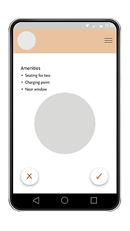
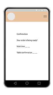
UI Highlights
-
Step-by-step customization
-
Group order creation
-
Payment integration
-
Story screens for marketing
-
Ongoing work to optimize layout for both left- and right-handed users


06
Marketing concept
Told through a playful narrative: a robot learns to brew perfect coffee using a vampire's magical cookbook. This emotional storytelling approach was used in visual mockups to position the brand as whimsical and user-centered.

07
Content Strategy & UX Writing
Objective:
To improve clarity, engagement, and task completion by crafting purposeful in-product language tailored to casual coffee drinkers and returning users.
Approach:
-
Rewrote button labels and screen headers to sound friendly, descriptive, and action-oriented.
-
Used familiar, casual language to match the user mindset during relaxed browsing.
Examples:
-
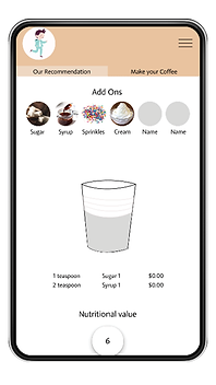
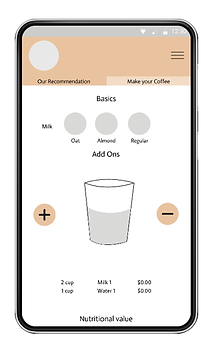
Changed “Menu” to “Our Recommendations” – users interpreted this as curated, making it easier to decide.
-
Replaced “Make Your Own Coffee” with “MYOC” initially, but later switched to “Make Your Coffee” after usability testing showed “MYOC” was unclear to new users.
-
Simplified ingredient names by aligning with the most commonly understood terms from user interviews.


08
Iconology
